What does red mean?

When it comes to interior design, whether its in the kitchen, bathroom or even the garden, red is usually seen as a very vibrant and strong colour. It can add a lot of flavour to a space and, depending on the shade of red you choose, can really range from creating a subtle soft space through to a striking statement.
But what do we associate red with?
Well, it is not surprising that red is more often than associated with romance and deep passion. It is there to draw attention, really shout out loud and communicate the emotions whilst helping stimulate the senses.

But that is not all. Red also projects power and strength – and is there when you want to make a statement. Whether it is using subtle shades of red to create a sense of comfort and relaxation or strong tones for boldness, desire and luxury.
How can you use red Moroccan tiles?

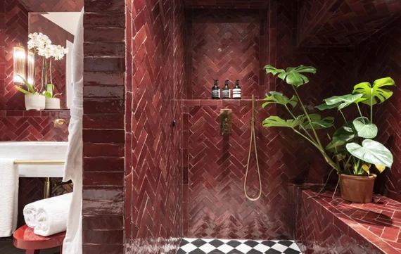
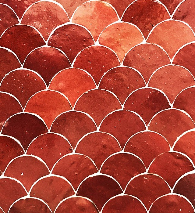
Red Moroccan tiles are perfect for a show or statement piece, whether that is in the hallway to greet guests, or in the bathroom to really drive the emotion and spirit. What you want to absolutely do is give the red tiles their own dedicated space to really work their magic, whether its a wall, or a specific floor.
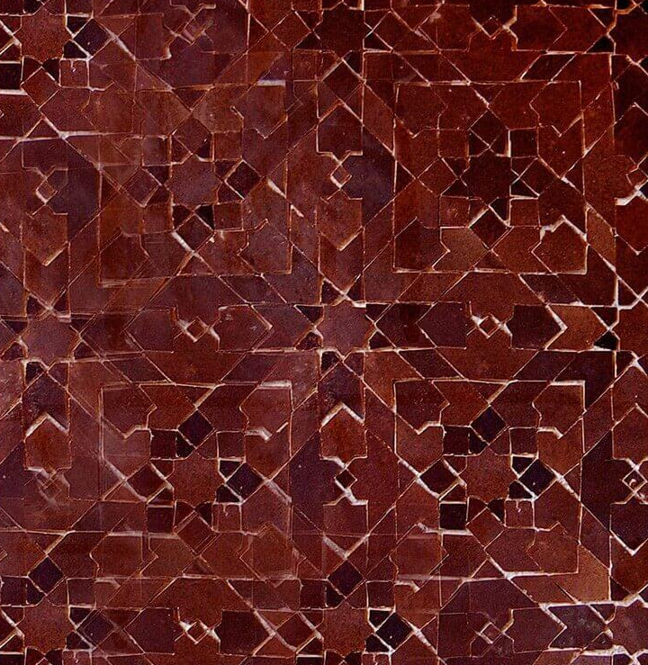
A dedicated space, with an authentic red Moroccan tile pattern will really communicate character – so you really want them front of house as that is where they will have the most impact.
Using deep shades of red really help to bring colour, invigoration and light into a space, especially where there is plenty of sunlight. This helps make any space feel broader, whilst still maintaining that personal, intimate feel. As the light bounces off the red Moroccan tile you will see more of the tile effect.

One key thing to remember is that there is a fine line between a deep shade and too dark. Getting a Moroccan tile that is too dark can result in the space looking, and feeling, smaller and more enclosed.
The red tone really plays well with light, but if it is too striking, a subtle / pastel red Moroccan tile will help bring that soft comforting vibe, whilst still keeping the space broad. You can also interplay deep red with lighter shades which gives a sense of playfulness and in some case that does work well.